G is for Gauge…
by David Catoire
…and that’s good enough for me. Not quite that simple; but it’s a start. And luckily, my vocabulary is a little better than that of Cookie Monster. Here at Mesh, Gauge Construction & Development is a brand new name, and thus, needed a logo built from the ground up.Without the confines of past aesthetics or brand equity we were free to entertain a lot of ideas. Overall, the logo needed to be clean, strong, and as with most construction companies, it had to be a relatively quick read since it would most frequently be seen on worksite signage.
The typeface choices were settled on first. GAUGE is set inEurostyle ExtendedTwo– just bold enough, with prominent vertical and horizontal lines setting each letter comfortably in its relative space – strong yet approachable. The font,DIN Light, is used for CONSTRUCTION & DEVELOPMENT and is a great compliment toEurostyle– being condensed and lighter, but still exhibiting strong vertical sensibilities, again seeming to hold each character perfectly in place; forming a line that underscores the word above it – visually as well as descriptively.
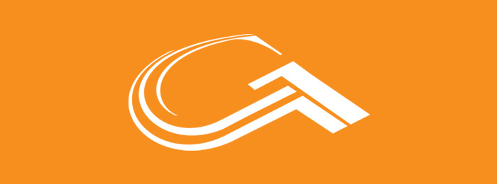
While working on the mark, the preliminary ideas were narrowed to three: a graphic representation of rooftops, a stylized drawing of an actual gauge, and a good ole’ letter G. The direction that was settled on was to design a mark based on the uppercase letter G.
Rather than have a mark that simply sits up there saying, “yep, I’m a G”; we decided to also incorporate a subtle, but discernible representation of rooftops as well. In the bottom right portion of the symbol are the serif and descender of the G. These elements make up the “rooftops”. The angle we required of the rooftops allowed us to play with the positioning and perspective of the G, creating a nice feel of movement to the left, around, and up, finishing off the top of the letter. The solid, angular look of the “rooftops” represents the strength and integrity of Gauge’s work, while the “curve” represents their quality of encompassing all aspects of a project –everything is under control.
The symbol is dressed all in orange,Pantone 021, indicative of construction, craftsmanship, and tools; while the typography is treated withPantone Cool Gray 9. Along with its size and placement, the cool toned typography offsets and compliments the warm tone of the symbol, while also grounding the mark as a whole.